Showing posts with label color mosaic contest. Show all posts

Friday, May 22, 2015

Nuanced Neon Voting Now Open

Hi friends!  Stitched in Color is having another color mosaic contest.  The theme this time is #NuancedNeon.  See my first post about it here.  

She just announced the finalists today and I'm happy to report that she picked my Classy Clashy Brights as one of the top 10!  Head over to her page to vote for your favorite (I really hope it's mine!) now through noon on Monday the 25th.  The two winning mosaics will be announced on Monday!

visit Stitched in Color to vote


Fabrics are as follows, left to right, top to bottom: 1. Speckled in Periwinkle, 2. Pressed Leaves,  3. Butterflies in  Red, 4. Gingham in Silver,  5. Leaves in Ultramarine,  6. Chasing Butterflies in Fruit Punch,  7. Word Find in Pink,  8. TinyScript in Red,  9.  Leaves in Plum

Wednesday, May 20, 2015

Color Mosaic Contest - Nuanced Neon

Stitched in Color is once again having a color mosaic contest, sponsored by Mad About Patchwork.  The theme this time is Nuanced Neon...


Two winners will receive a FQ bundle of their fabric choices!  The contest runs through midnight tonight at which time Rachel will choose her favorites and then open up voting to the rest of us with the final winners announced on May 25th!  So get your entries in and then remember to go back and vote for your favorites!

Rachel guides us to "choose fabrics to express your interpretation of Nuanced Neon.  Your collection of fabrics can be playfully bright neon or more nuanced with neutrals or soft shades.  Just make sure to include a few very bright colors.."  I have been dying to make a neon quilt!  I LOVE neon; its my absolute.favorite.color.ever!  Just ask my husband.  He gets so sick of my overly saturated running shoes, pants, and jewelry.  


Nuanced Neon #1 - Tempered Brights

I wanted to create a more grown-up version of neon with this color palette.  I think that the bright oranges and greens are nicely off set by the soft blue and pink.  They give the whole thing a slightly more sophisticated feeling.  The warm grey neutrals give your eye somewhere to rest and pause.  So that even though your energized, you are still focused and calm.

Fabrics are as follows, left to right, top to bottom: 1. Dots in Sappy Green, 2. Droplet in Carrot, 3. Lilac Meadows in Bermuda, 4. Lulu in Persimmon,  5. Mercury in Chartreuse,  6. Ink in Parchment,  7. Apricot Sunstone,  8.Climbing Vine in Khaki,   9.  Fox Shrine in Green


Nuanced Neon #2 - Clashy Classy Brights

I'm fairly certain I've worn an outfit in these exact colors.  There is something so satisfying about these clashy bright colors all together.  They are pleasing to the eye but there's also something about them that makes you a little bit uncomfortable.  And if I'm not a little bit uncomfortable each day then I know that I need to make a change.  These colors inspire me to be open, excited, happy, strong, and adventurous.

Fabrics are as follows, left to right, top to bottom: 1. Speckled in Periwinkle, 2. Pressed Leaves,  3. Butterflies in  Red, 4. Gingham in Silver,  5. Leaves in Ultramarine,  6. Chasing Butterflies in Fruit Punch,  7. Word Find in Pink,  8. TinyScript in Red,  9.  Leaves in Plum


Thursday, January 15, 2015

Mosaic Contest - Ice Parfait

Stitched in Color is once again having a color mosaic contest, sponsored by Cuts of Cotton.  The theme this time is Ice Parfait...


Two winners will receive a FQ bundle of their fabric choices and have their bundle sold in the store for others to purchase!  The contest runs through midnight January 22nd at which time Rachel will choose her favorites and then open up voting to the rest of us with the final winners announced on January 26th!  So get your entries in and then remember to go back and vote for your favorites!

Rachel describes the theme as "fabrics [that] can be very simple, nuanced with angles, incorporat[ing] black, gray or both.  Just make sure to include icy colors in a way that feels still and wintry to you."  In case you missed it, it's been solidly below zero here most nights for the past few weeks and has barely reached a temperature above zero during the days.  I'm so ready to think about Ice Parfait.


Ice Parfait #1 - SUNRISE


Winter mornings are so beautiful.  So many soft and delicate colors.  And the days are short so while I drive to work during the coldest days I get to watch the sun rise.  Those colors!  The sky is a rainbow of pastels.  The trees are dark against the soft sky and tinted snow.  Everything still sparkles from the early morning sunlight.

Fabrics are as follows, left to right, top to bottom: 1. Architextures - Crosshatch - Lake, 2. Architextures - Script - Charcoal, 3. Doe - Breeze - Sky, 4. Doe - Intersections - Blue, 5. Doe - Ladder Lines - Natural, 6. Pearl Bracelet - Peach, 7. Pearl Bracelet - Taupe Pearl, 8. Squared Elements - Seafoam, 9. Prisma Elements - Pearl and Gold Metallic


Ice Parfait #2 - DAY


I love winter.  I love the cold.  I love the days when it's just so cold outside that you can feel the ice form in your lungs when you breath.  There is something so refreshing about those days.  They are so simple.  When the wind blows and the snow flies, you are pushed to hurry along inside but the sun peeking through the grey, drab sky beckons you to stay and enjoy the simplicity of the moment.  Everything is covered in snow but the evergreens fight through to show off their still green needles even though the rest of the trees have given in and turned to the soft, snow dotted grey that they tend to become in winter.  Moments like these speak to me.  They beg me to stay; to live in that one moment and just breathe.


Fabrics are as follows, left to right, top to bottom: 1. Sun Print - Text - Black, 2. Pearl Bracelet - Taupe Pearl, 3. Doe - Breeze - Sky, 4. Doe - Droplet - Sky, 5. Architextures - Crosshatch - Fern, 6. Quilter's Linen - Snow, 7. Prisma Elements - Pearl and Gold Metallic, 8. Essex Yarn Dyed Linen - Flax, 9. Calico - Forest


I ended up making one extra mosaic.  While I was on this theme I wanted to also capture the beauty of the night in winter.  It's not very parfait-y but it is still gorgeous non the less.

Ice Parfait #3 - NIGHT


At night, the sky goes black and the mercury retreats lower, trying to stay warm.  The grey clouds from the day begin to break and suddenly, after the sun has fled the cold dark night, the clouds give way to the most clear and beautiful night you could ever imagine.  The stars fight to be seen over the glitter of the white snow in the cold moonlight.  Everything is black and white, except for the places where the trees stand up against the cold night.  They are blue and grey and their shadows cast a paler version of themselves, elongated onto the snow.  A night like this, when the milky way could reach out and slap you with it's clear brilliance, is something you never forget.

Fabrics are as follows, left to right, top to bottom: 1. Doe - Crisscross - Blue, 2. Architextures - Script - Black, 3. Pearl Bracelet - Midnight, 4. Oval Elements - Silver Drops, 5. Pearl Bracelet - Shadow, 6. Doe - Droplet - Sky, 7. Architextures - Crosshatch - White, 8. Doe - Intersections - Blue, 9. Prisma Elements - Pearl and Gold Metallic


Thanks for visiting and good luck to all who enter the giveaway!

Thursday, October 9, 2014

A Mosaic Contest - Folksy Fall

Stitched in Color is once again having a color mosaic contest, sponsored by The Intrepid Thread.  The theme this time is Folksy Fall...

Two winners will receive a FQ bundle of their fabric choices and have their bundle sold in the store for others to purchase!  The contest runs through midnight October 12th at which time Rachel will choose her favorites and then open up voting to the rest of us with the final winners announced on Thursday, October 16th.  So get your entries in and then come back to vote for your favorites!

Rachel describes the theme as a "collection of fabrics [that] can be pretty, funky, dramatic or totally playful.  Just make sure to include a variety of colors complimented by some rich fall neutrals - browns, grays or navy blue."  I spent a bit of time thinking about what this means to me.  I think that funky, whimsy, and playful are right up my alley when it comes to fabric choices and rich fall colors with neutrals? I think I tend to do that pretty well too.


Folksy Fall #1

With this mosaic I wanted to capture both the warmth and chill of fall.  The winds are starting to get chill and the nights are getting cold, but the sun is still warm when it shines.  Some of the late flowers are still in bloom and there are still a few butterflies hanging around but the birds have begun to migrate south to warmer climates for the soon-to-arrive winter.  The spring fawns are nearly grown and the deer proudly display their fall antlers this time of year.  The trees change too.  Orange, yellow, and purple dot the mountains.  Soon the leaves will fall and all that will be left are the dark brown trunks and faded brown leaves crunching underfoot.

Fabrics are as follows (left to right top to bottom): 1. Sweet as Honey - Fly by Night, 2. Catnap - Pilgrim Butterfly in Yellow, 3. Indelible - Time is Dear in Ember, 4. Waterfront Park - Domino Dot in Geranium 5. Pretty Potent - Mary Thistle in Eggplant, 6. Meadow - Valley of Azure, 7. True Colors - Herringbone in Maple, 8. August - Frolic in Coral, 9. Cotton + Steel Basics - Dottie in Caviar, 10. Winged - Wingspan in Fig, 11. Sweet as Honey - Cherished Deer Sepia, 12. Catnap - Finn in Orange


Folksy Fall #2

I wanted to be more playful with this mosaic.  Brighter colors and playful patterns.  I love how the green, orange and violet play off of each other.  These are tertiary colors, meaning they are equidistant from each other around the color wheel.  That's why, even though they are a little clashy, they still work together.  I wanted a warm grey to offset the bright colors - like the color of the fall sky on an overcast day.  But the sun does still shine bright and metallic through the clouds on occasion so I needed a little bit of sparkle with the pearl bracelets and Cotton+Steel netorious. 

Fabrics are as follows (left to right top to bottom): 1. Pearl Bracelets - Metallic Copper on Cream, 2. Brambleberry Ridge - Flight in Orchid, 3. Far Far Away - Clover in Orange, 4. Cotton+Steel Basics - Dottie in Gnome Hut 5. Lottie Da - Vintage Rose in Tangerine, 6. Riddles and Rhymes - Foulard in Red, 7. Briar Rose - Cricket Clover in Lilac, 8. Pretty Potent - Mary Thistle in Cumin, 9. Winged - Feathered Flight in Acorn, 10. Cotton+Steel Basics - Netorious in Cloud Silver, 11. Bungalow - Chevron in Lavender, 12. Field Study - Coordinates in Kelly


I had a lot of fun pulling these bundles together.  Regardless of whether or not I will, I have a feeling that they may find themselves in my mailbox relatively soon.  Remember, you have until Sunday, October 12th to get your entry in for the contest!


Thursday, March 27, 2014

Another Mosaic Contest - Ethereal Spring

Stitched in Color is once again having a color mosaic contest, sponsored by Lark Cottons  The theme this time is Ethereal... Think soft, lovely colors; uplifting pastels in a variety of colors.  The winner receives a FQ bundle of their fabric choices.  I spent some time choosing my fabrics and ultimately created three bundles.


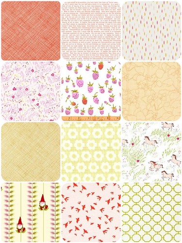
#1:  Soft pinks and greens recall lazy spring days basking in the warming sunshine and enjoying all that this time of year has to offer.

Fabrics:
Architextures | Crosshatch Tangerine
Sun Print | Text Orange
Dreamin’ Vintage | Jolly Dots Petal
Wee Wander | Meandering Petal
Briar Rose | Strawberry Lilac
Botanics | Graph Paper Garden Curry
Architextures | Crosshatch Curry
Boho | Flower Child Meadow
Wee Wander | Summer Ride White
Better Gnomes and Garden | Leaf Gnome Stripe Pink
Waterfront Park | Flight Clementine
Good Life | Garden Gate Spring


#2:  Cool purples, pinks, and blue invoke the sometime chilling breeze of spring while the winter fights back against it's eminent retreat.

Fabrics:
Squared Elements | Watermelon
Sew Stitchy | Check Dot Glass Olive
Comma | Swinging Chalk Lime
Sun Print | Text Navy
Terrain | Footpath Mist
Wee Wander | Meandering Seafoam
Sew Stitchy | Circle Birds Glass
Noteworthy | Birds on a Wire Kisses
Innocent Crush | Maybe Blossom
Backyard Baby | Birch Forest Aqua
Squared Elements | Lemongrass
Posy | Story Daisy


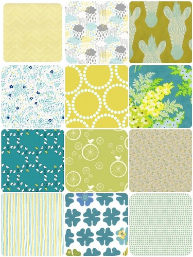
#3:  Vibrant yellows and greens are everywhere with the daffodils and the tulips pushing through the warming ground.  The birds are returning and singing us a song as we enjoy this special time of year.

Fabrics:
Reunion | Sally's Skirt Key Lime
Blown Away | Rainy Day Blue
Africa | Zahara Olive
Wee Wander | Meandering Seafoam
Pearl Bracelet | Yellow
Nicey Jane | Picnic Bouquet Lagoon
Meet The Gang | Bird Lattice Teal
Mod Basics | Birdie Spokes Grass
Seaside | Beach Chair Gray
City Weekend | Downtown Stripes
Just Wing It! | Four Petals White Turquoise
Squared Elements | Seafoam


Now I need your help.  I can only submit two mosaics.  Which two do you think best embody the spirit and essence of the Ethereal Spring which is always "extremely delicate and light in a way that seems too perfect for this world."


Which two mosaics are your favorite?
  
pollcode.com free polls 


While you're at it, be sure to make your own mosaic before April 3rd for a chance to win!

Happy Quilting!

Thursday, January 16, 2014

Pink is... Color Challenge

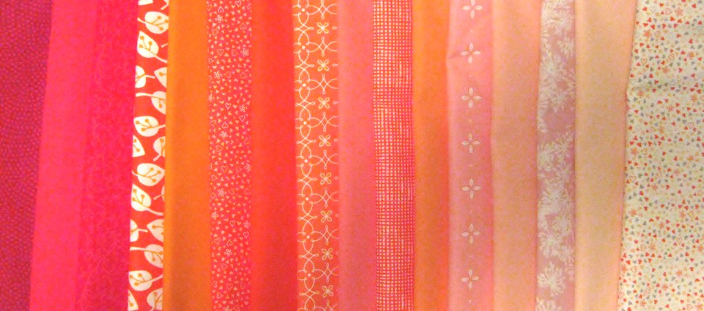
Stitched in Color is once again having a color mosaic contest.  The theme this time is Pink.  The winner receives a FQ bundle of their fabric choices.  I spent some time choosing my fabrics and ultimately decided on the following:


Fabrics are:

Art Gallery Fabrics, Minimalista - Confetti, Watermelon
Bonnie and Camille - Scrumptious Dots, Pink
Sweetwater Wishes - Cake Topper, Vanilla Red
Birch Organics, Mod Basics 2 - Skinny Chevron, Coral
Lizzy House, Pearl Bracelet - Peach
Michael Miller, Birds of a Feather - Twigs, Coral
Lizzy House, Pearl Bracelet - Persimmon
Violet Craft, Waterfront Park - Domino Dot, Geranium
Birch Organics, Storyboek Two - Foxy Floral, Coral
Carolyn Friedlander, Botanics - Branches, Tangerine
Heather Ross, Briar Rose - Nanny Bee, Coral
Art Gallery, Pure Elements - Coral Reef


I think it's both quiet and loud.  I find Pink to be relaxing and energetic.  Pink is such a nuanced color with so many different iterations, each with their own unique ability to evoke a different mood or emotion.

Pink is quiet and soft and demure.
Pink is understated and misunderstood.
Pink is often overlooked.
But Pink is strong and Pink is powerful.
Pink is fun and joyful and loud.
Pink is always undeniable.


This challenge is actually perfect timing for me.  I've been pulling together pinks from my stash for a block of the month quilt in just this very color palette.  What do you think?


If you like my board be sure to head back to Stiched in Color on Friday, January 24th and vote for me!