Do you ever see a picture or a photograph and think: "Wow! Those colors would make a lovely quilt!"? Me too. All the time. Usually I just end up pinning the picture, then maybe printing it or looking at it side by side with the
Kona webpage (because I don't have a Kona color card). Definitely not ideal or exact.
Well a few days ago I discovered the Play Craft Palette Builder 2.1, I'm not sure how I stumbled upon it but, boy oh boy, am I glad that I did. Play Craft is a great website. They have
patterns,
tutorials, and fun
projects available for free. They are also one of the link up sites for the
2014 Pantone Quilt Challenge, inspired by this years color: Radiant Orchid. Here's what their About page has to say about them:
Play Crafts came about after a late night conversation among friends about the lack of tools available for crafters. But we didn’t want to just make any tools, we wanted ours to be easy and fun to use, because creativity should be fun! Our goal is to provide tools that get out of the way of your creativity and let you chase your inspiration.
The
Palette Builder 2.1 is, in my opinion, one of the coolest features of their website. All you do is upload a picture that you really liked the colors in or found inspiring, and BAM! it does almost all the rest. For example, let's say I wanted to make a quilt inspired by a photograph I had seen in online magazine. Save it to your computer and click the Load button on the palette builder. The Palette Builder will automatically select colors from the image AND tell you the coordinating Kona solids.
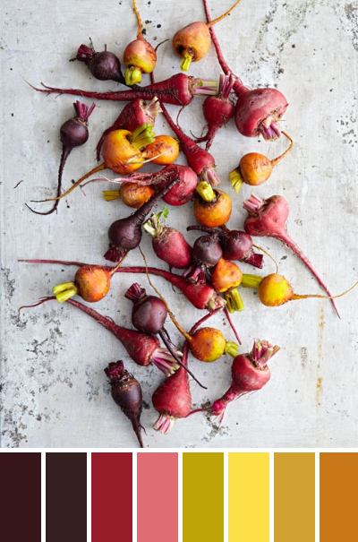
And if you're not happy with the first pass, you can edit any of the colors or add more to choose which colors you want to accent from that photo. This is the final palette I came up with based on this photograph. The coordinating Kona solids are (from left to right) Burgundy, Brown, Chinese Red, Melon, Wasabi, Citrus, Curry, and Yarrow.
Here are a few more palettes I cam up with.
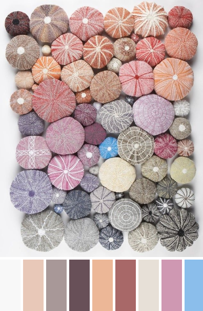 |
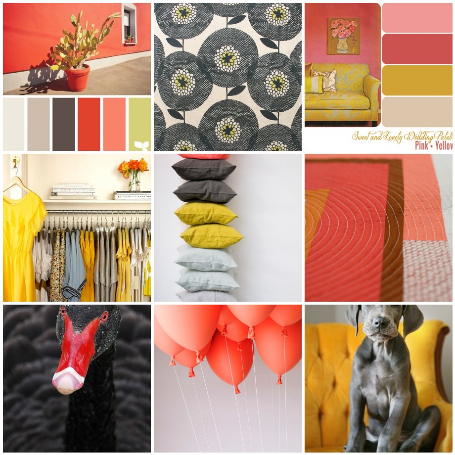
| Pastel Urchins |
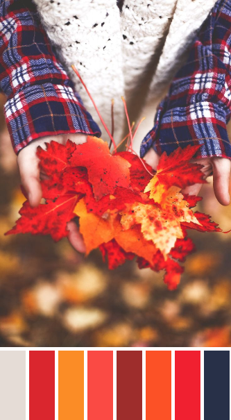 |
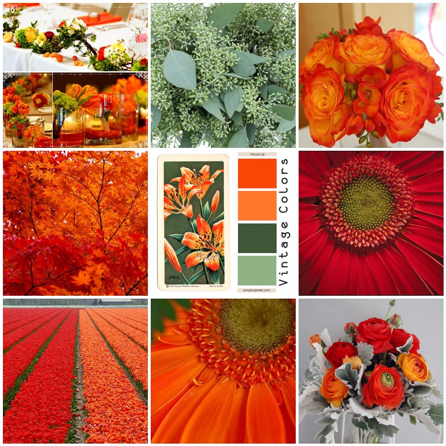
| Saturated Fall |
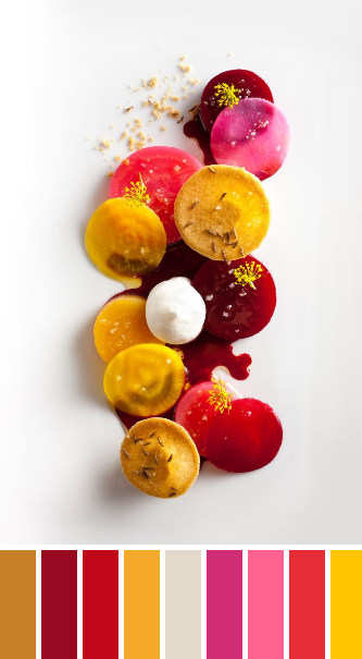 |
| Bright Beets |
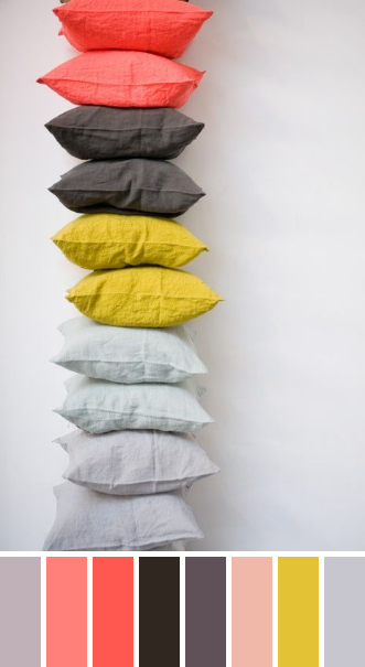
And just for fun I did one of the photo that inspired my [Pink - Grey - Yellow] color scheme. Would have been nice to tell my bee mates that the coordinateing Kona colors I'm looking for are (from left to right) Smoke, Melon, Coral, Espresso, Coal, Primrose, Wasabi, and Shadow. I'll keep it in mind for next time though!
Happy Quilting!